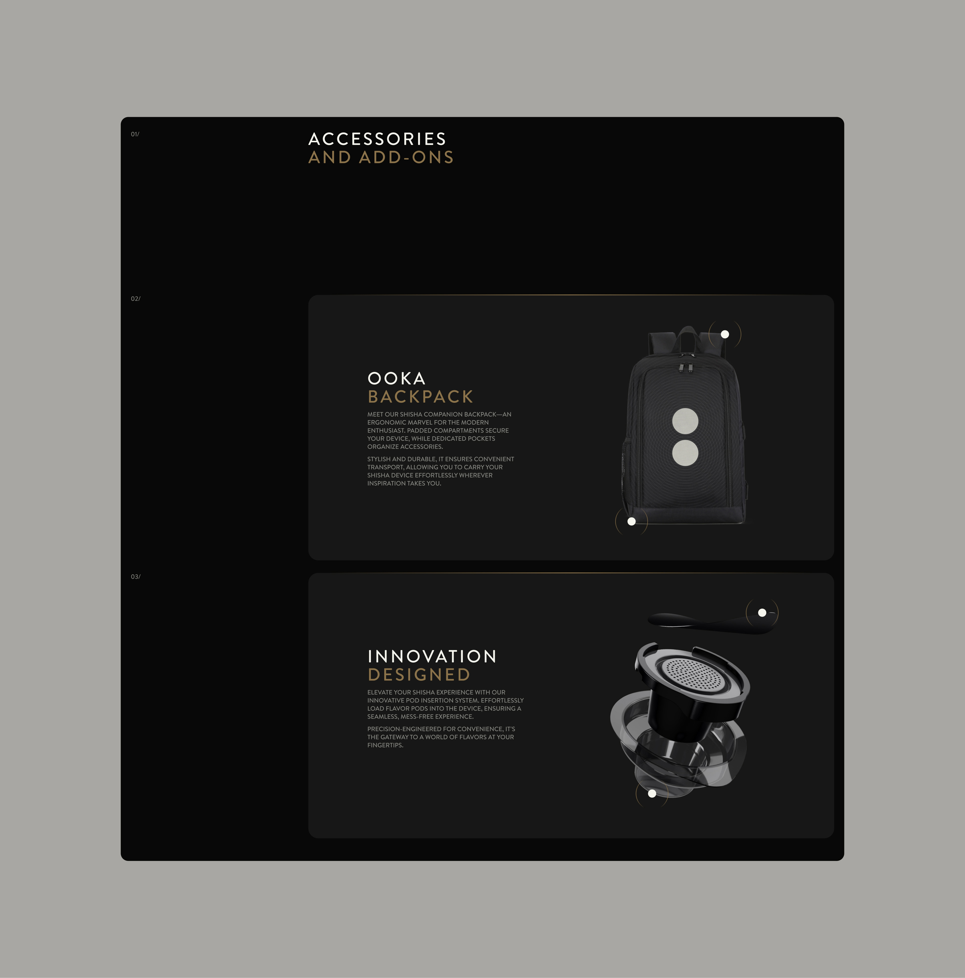


Ooka Device
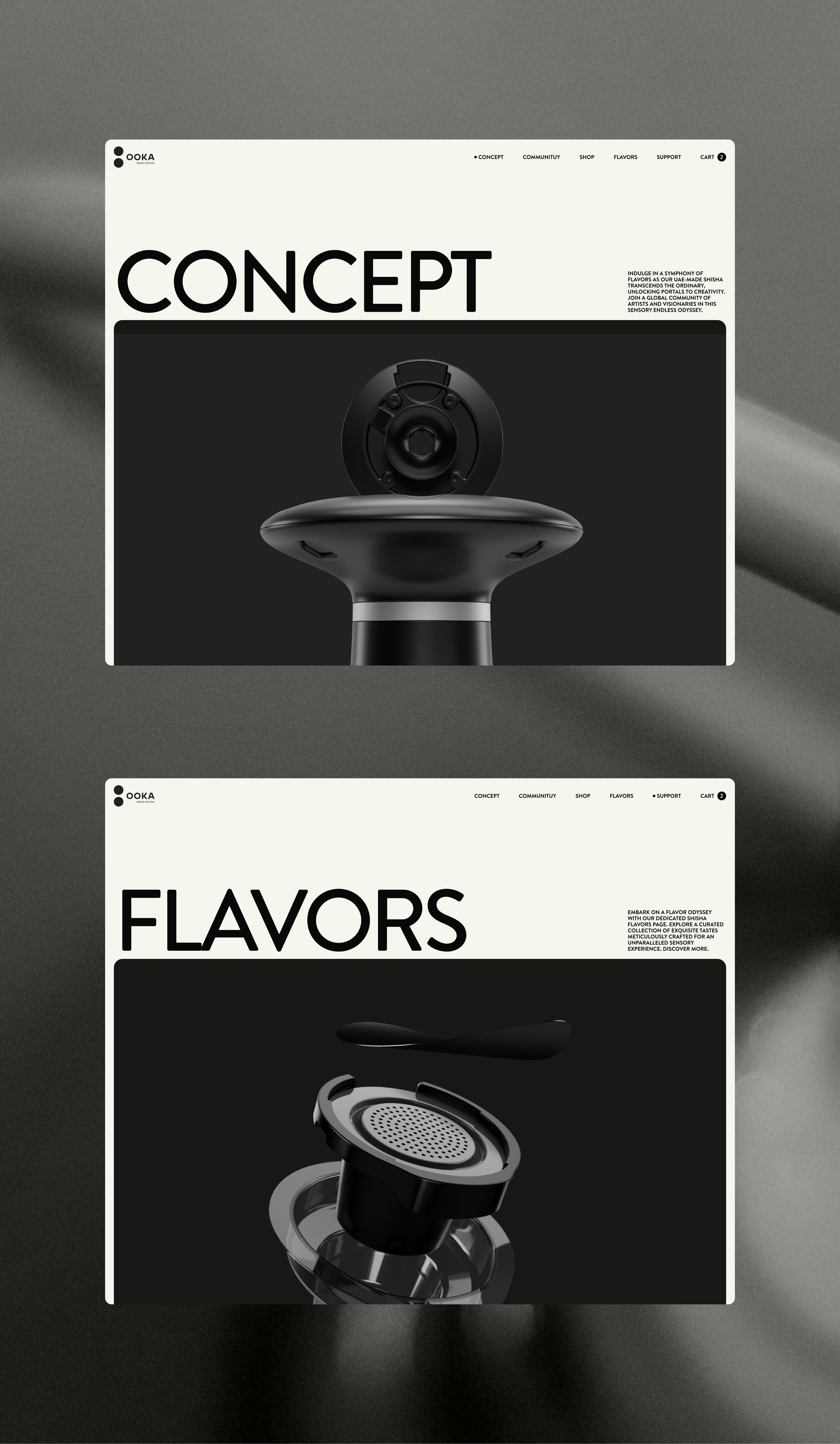
Cleanliness, order, and minimal rigour in a product that can open the imagination and make all creative people, artists, inventors and travellers in general explore new worlds. This is the meaning, short and dense, that Ooka wants to communicate.
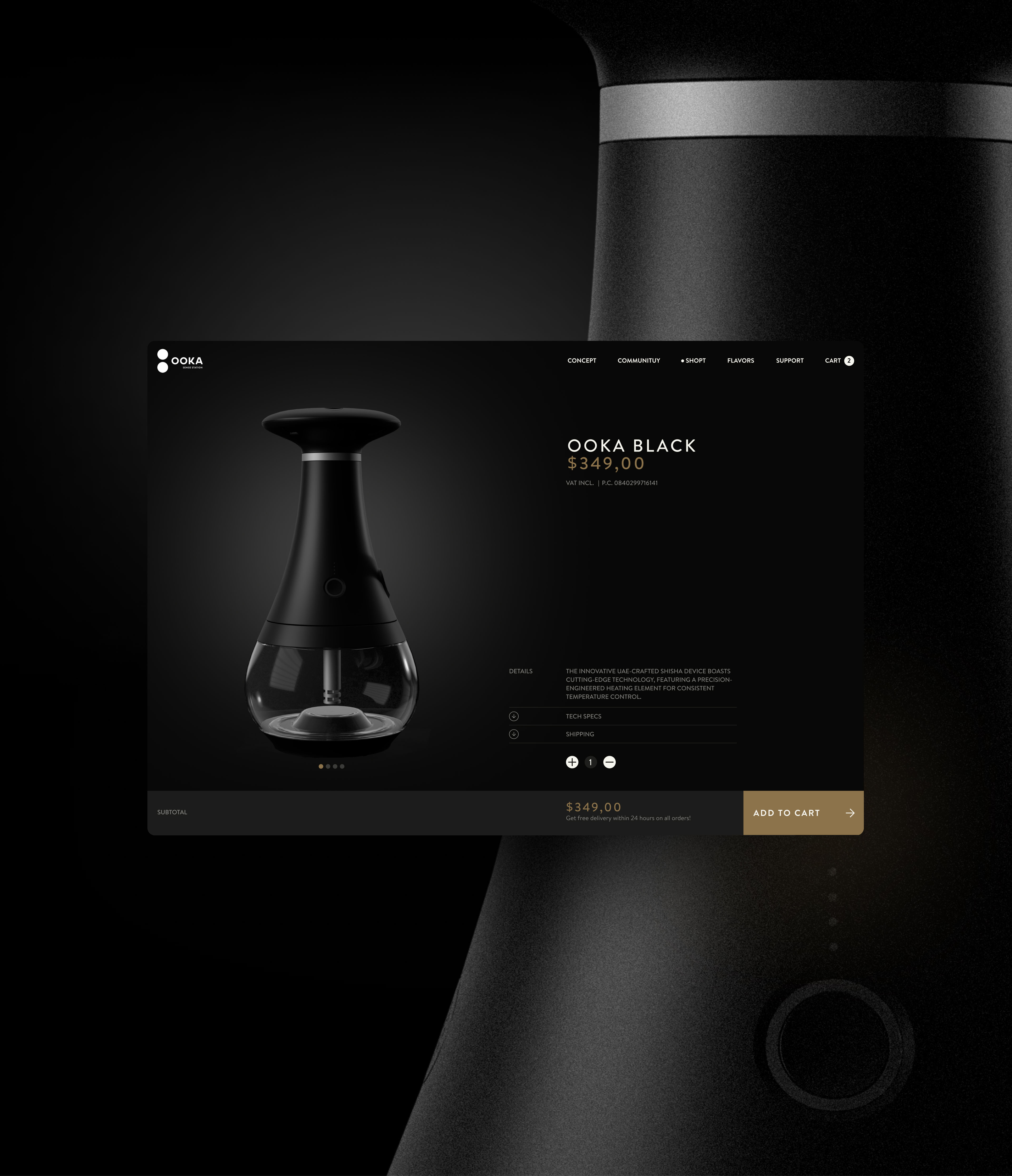
Website
/21
research
Ooka is a device with a minimalist, modern and technological design. Ooka is also a device strongly rooted in the tradition of the Middle Eastern world, one of those objects around which entire societies are built. Combining these worlds, cold modern minimalism and roots that go back thousands of years in tradition: these were the extremes of a research that was conducted on Middle Eastern visual elements and modern aesthetics.
EXPLORation
Needless to say, for a product with this kind of design, the Ooka team directed me as their main reference to the world of Apple and the whole aesthetic that has been built around this brand. Well aware, however, of the nature of the product in question and its cultural origins.
research
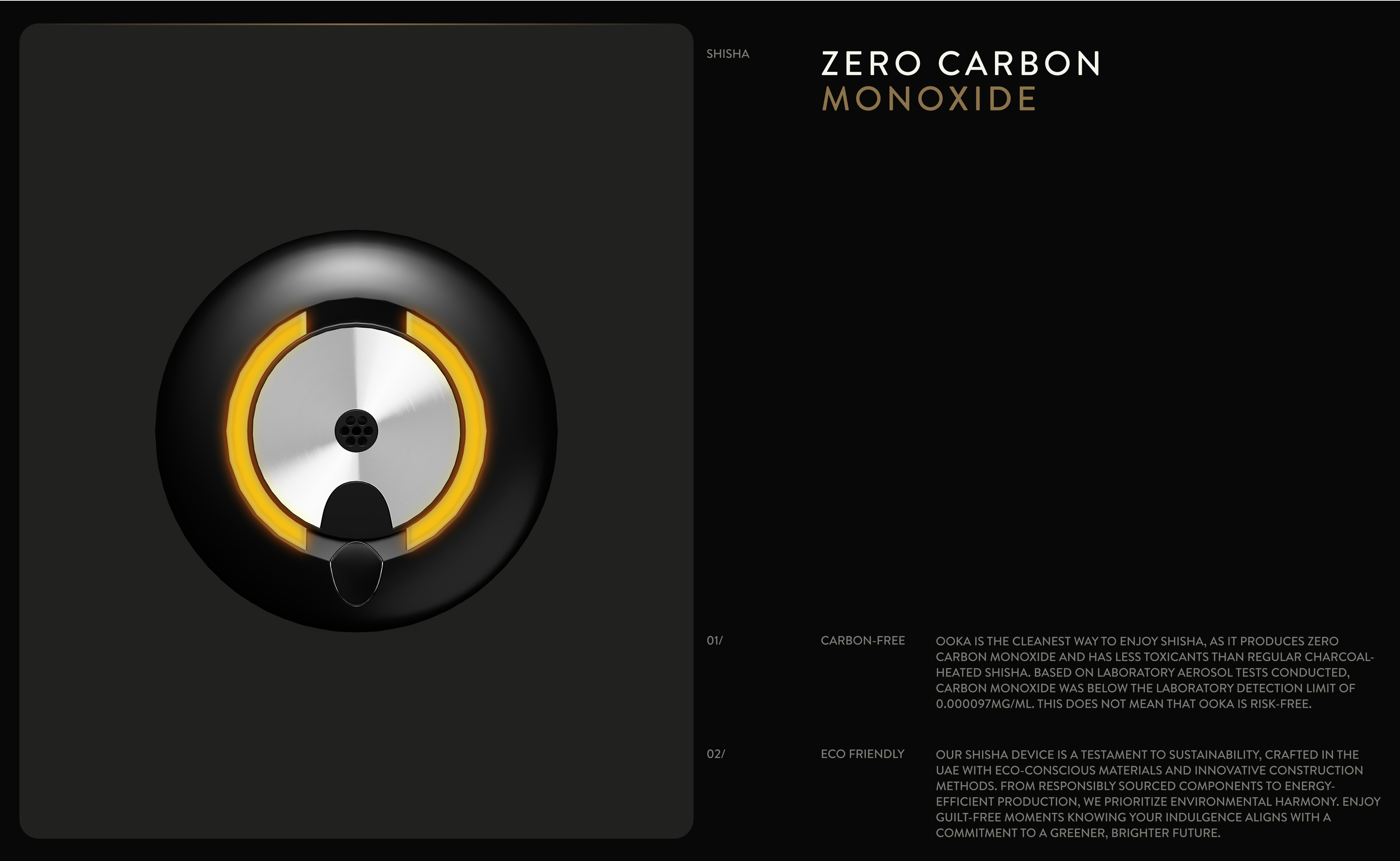
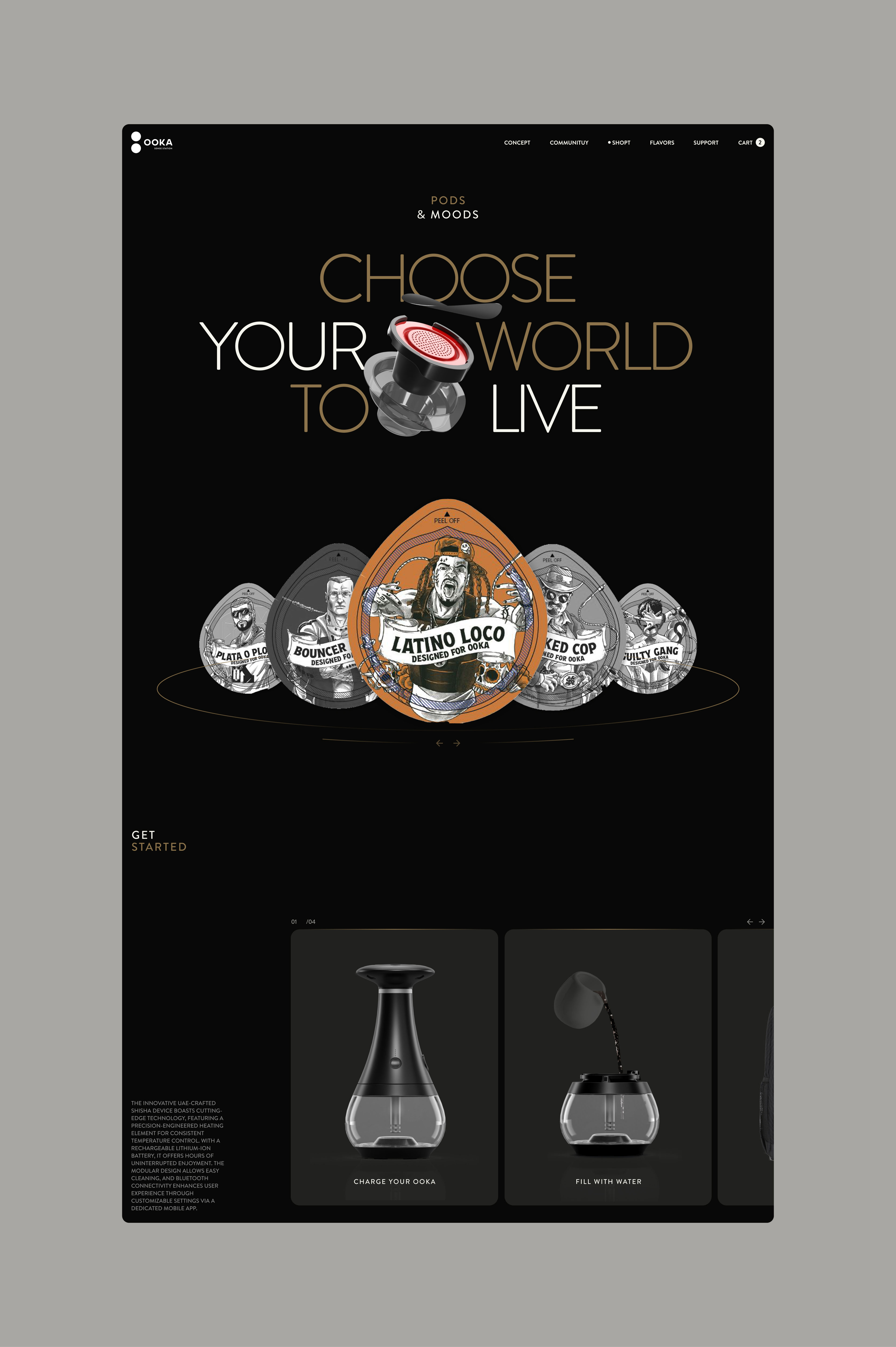
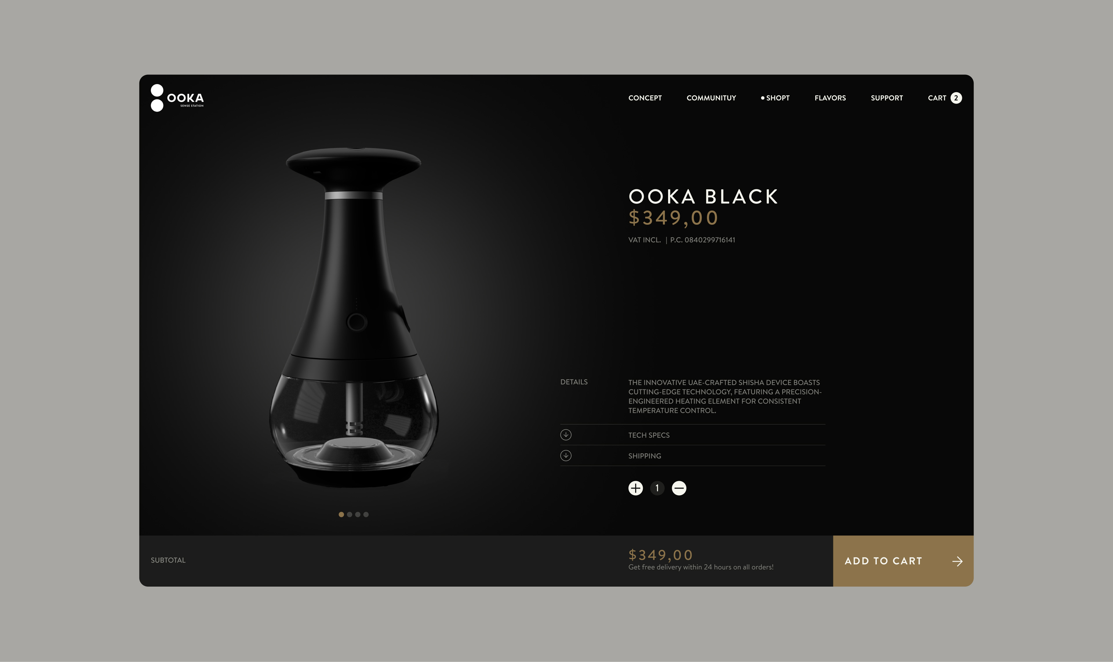
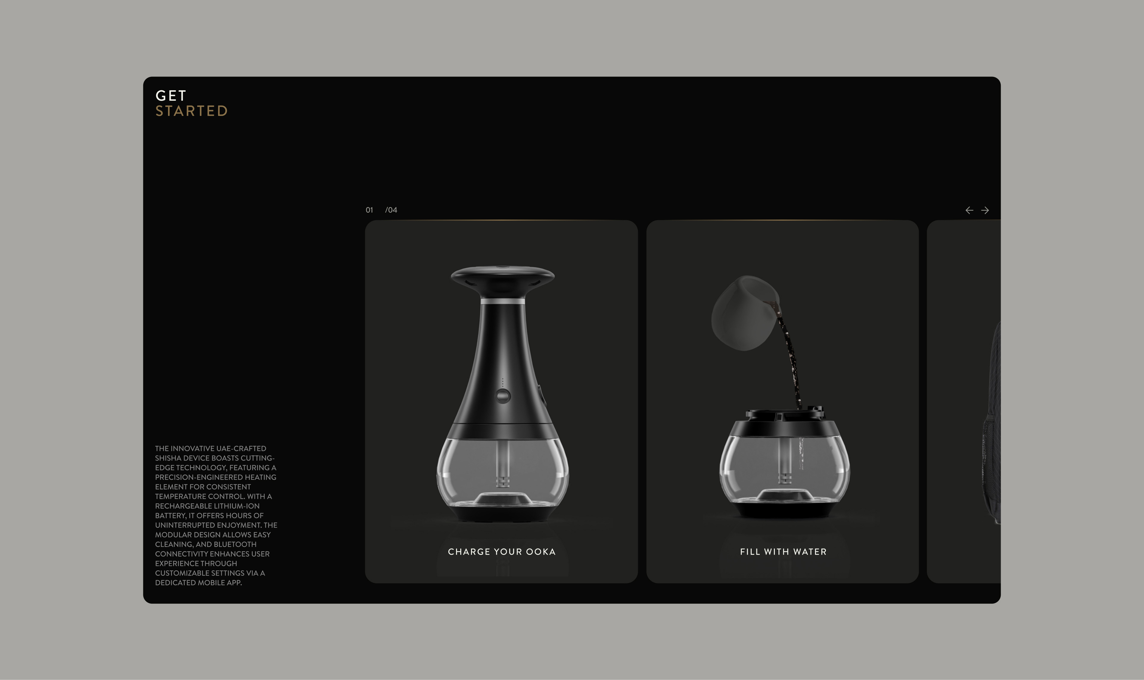
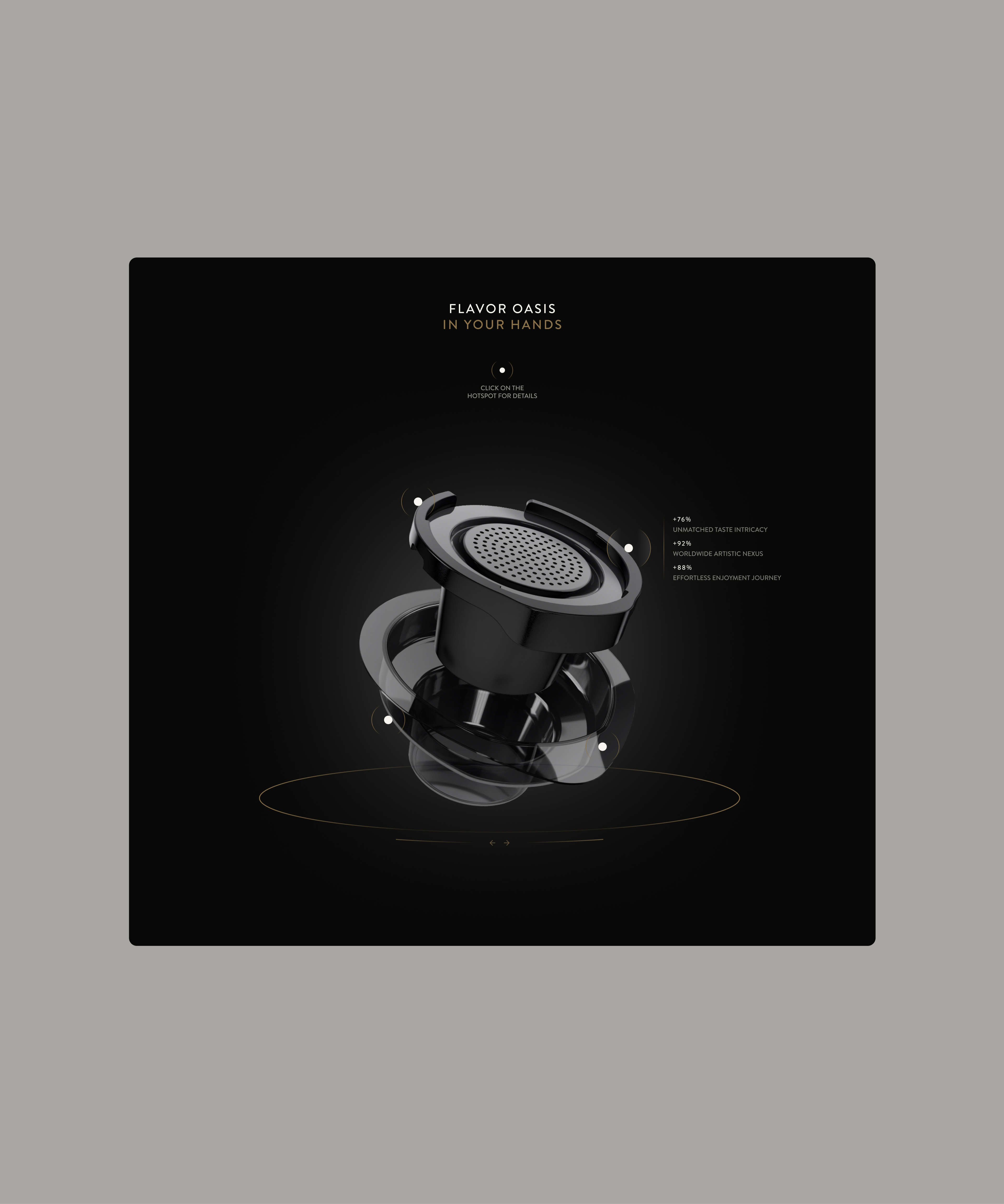
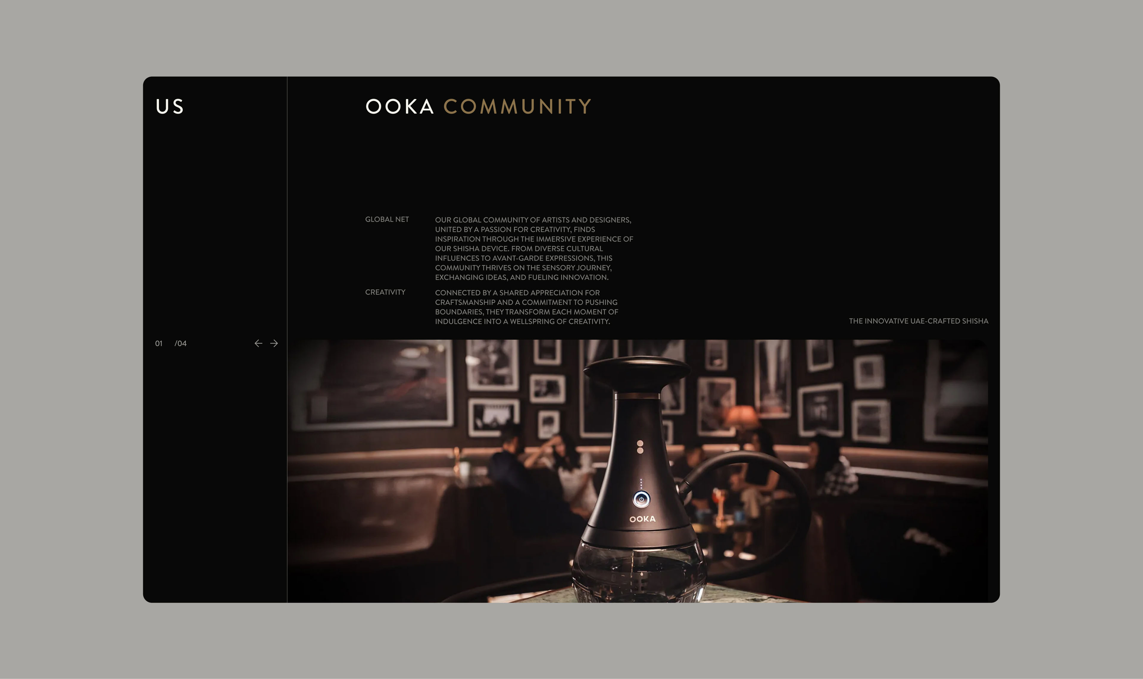
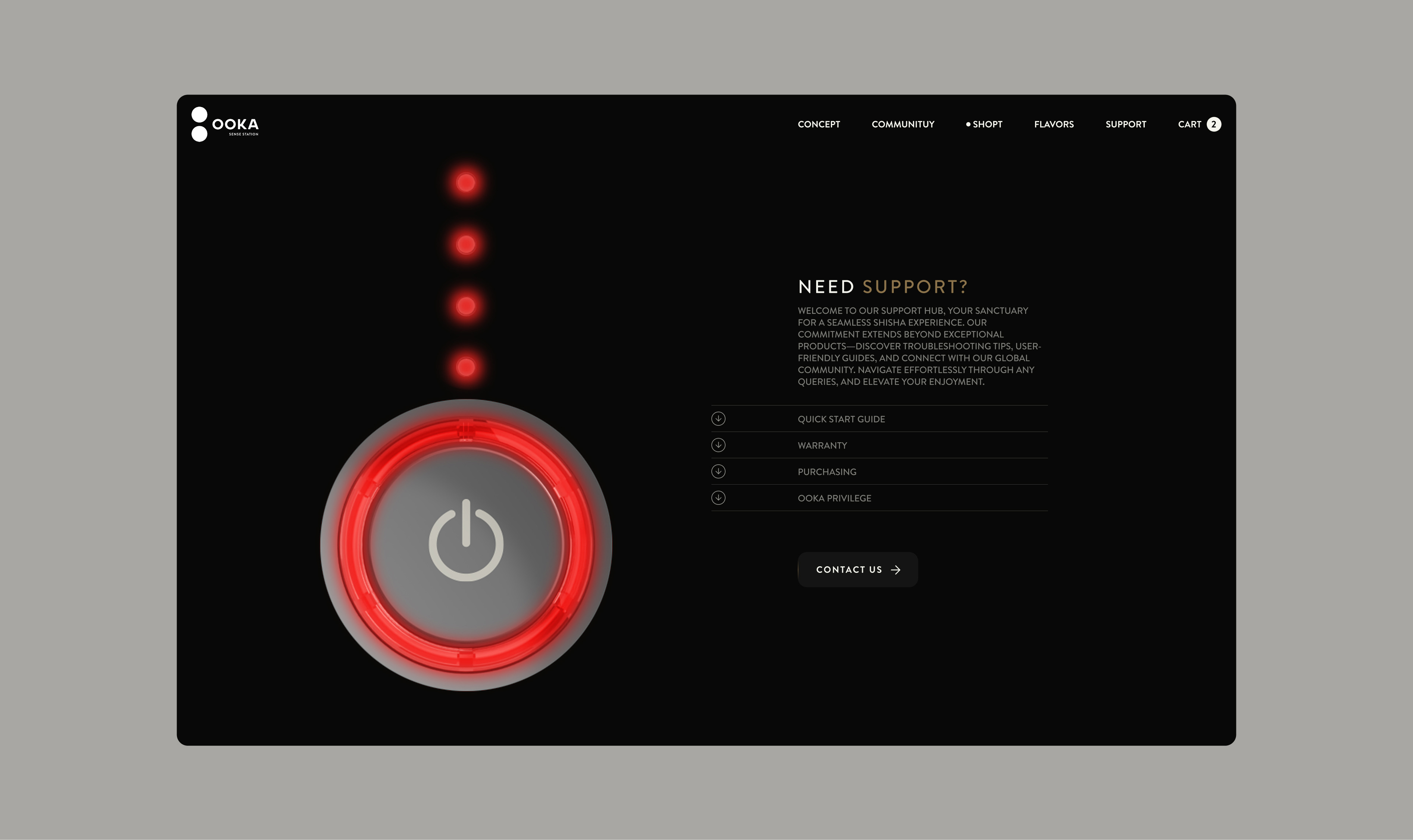
The final design reflects the identity of the brand and the product it promotes. The target audience, creatives and artists in search of inspiration, is an aesthetically sensitive one, which is why we kept to a minimal, elegant layout, but with identity elements, such as the gold coloured inserts, the accent colour of the site.
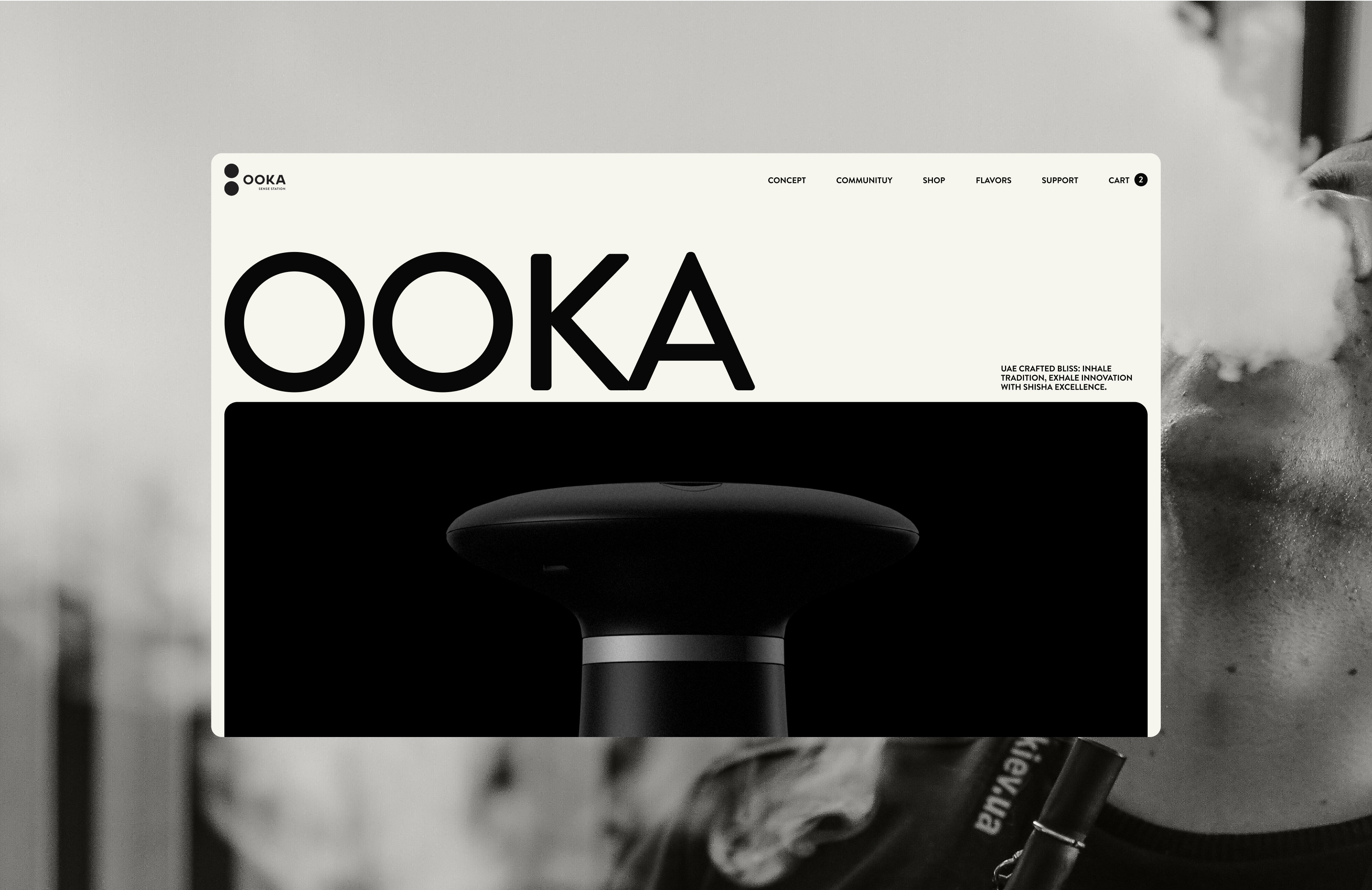
Conflicting extremes
Ooka is a high-tech device with a minimalist and modern design. Ooka isalso a device strongly rooted in the tradition of the Middle Eastern world, oneof those objects around which entire societies are built.
